Super Bowl XLVI


The Super Bowl. A game where people come together to watch their favorite team beat the other guy. Or watch a team they like beat a team they don’t like. Or in my case, watch two teams they don’t like play a rematch of a Super Bowl game that happened just four years ago. Yeah, the New York Giants vs the New England Patriots. It’s not ideal, it’s pretty far from it… I actually can’t think of a worse possible outcome, but regardless, I’ll be watching. And hopefully before game time I can be nudged centimeters to one side or the other so I can root for someone.

I’ve made it a habit of making posters for the Super Bowl for the past few years, and so I did again this year. Whether or not you like football, watching the Super Bowl is fun. But I find it hard that people don’t like football.

I mean, in the words of the great Jason Street #6:

Kid: Mr. Street, do you think God loves football?
Jason: I think that everybody loves football.


Advertisement

Faces Wallpaper

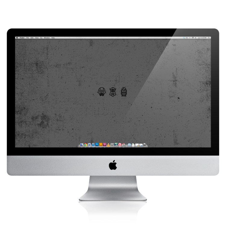
It’s the season of monsters and masks and creatures and pretty much everything spooky, and so I made this wallpaper. It’s just three spooky faces to keep your desktop or iPhone or iPad scary. It’s dark, but so are my feelings. xGothx.

Download the desktop version here, the iPhone version here, and the iPad version here.

Penmanship show

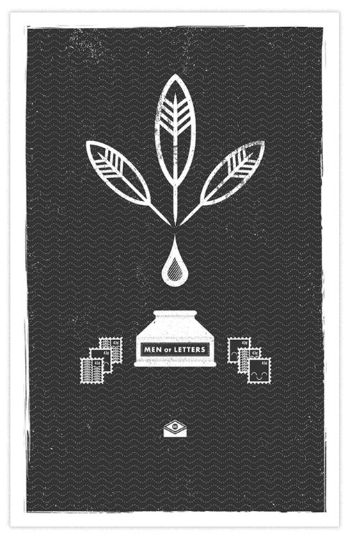
I was asked to be a part of the Penmanship show at Vox Populi, something curated by the very talented Grayhood, Mikey Burton, & Elysse Ricci, which was subsequently a kick off to the Design Philadelphia week, which I also had the chance to do some posters for. Needless to say, I was excited to be a part of the excitement!

The theme for this show was “penmanship”, and one of the only things I had to work from was this quote:

“A man’s penmanship is an unfailing index of his character, moral and mental, and a criterion by which to judge his peculiarities of taste and sentiments.”
—Philip Dormer Stanhope, Man of Letters

Because of the freedom and looseness to the theme, it left me at a loss for quite a bit. I sketched and sketched which sadly only resulted in failing ideas. I finally revisited the quote and looked outside of the quotations for some inspiration. I imagined what it would be like if there was a club or society called “Men Of Letters.” This took me in a new direction and it brought me to where I ended up. I wanted it to be representative of the act of making lines to form the letters of the alphabet, but also then the idea of taking those letters to form words, and those words to compose letters that you send in the mail.

It was really beautiful to see all the posters hanging together, knowing everyone put some serious thought into how they would represent this idea. For having some many designers take part in this, there was an obvious variety to the work, but also and impressively, a synthesis to everything. The show will be up until the 23rd, and I strongly suggest trying to make it out. I’m also hearing rumors of a closing show??? I’ll let you know if that’s happening. Probably though twitter.

It was also awesome to finally meet some people who’s work I’ve been following and admiring for some time and find out that they are regular people. Okay, some are super humans. But they still occasionally participate in some normal human activities.

(Photo courtesy of  Jim Viola.)

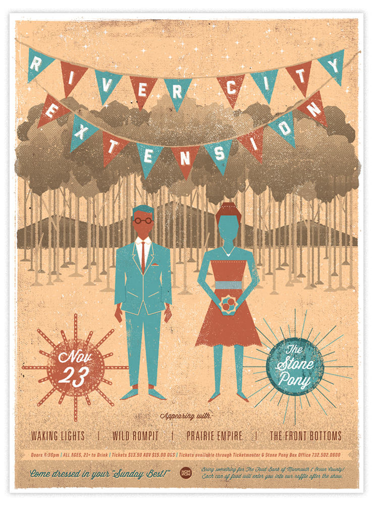
River City Extension at The Stone Pony 2011 poster

I was fortunate enough to have another to opportunity to make a poster for one of my favorite bands, River City Extension. They’ve sort of made it annual thing to come home and play a show at The Stone pony once a year and it’s been falling on the eve of Thanksgiving, and it’s become something that a lot of people, myself included, look forward to. Joe had shared with me his vision of making this show something people would dress up really nicely for .”Something like a wedding invitation” he told me. Not that this is like a typical wedding invitation, but that was the jumping point.

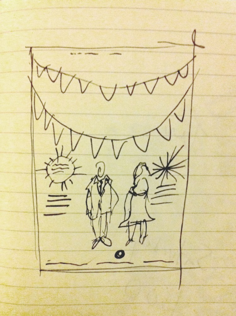
I started by sketching out a few quick ideas, and when I found the one I wanted to run with, I went into illustrator and started making it happen. I don’t normally post the beginnings of things, but I’d like to start, and no better example than this one.

Definitely proof that knowing what you want to do before you start doing it ALWAYS helps. And it’s sort of funny that things really didn’t end up too far from the original sketch.

Hope to see some of you at the show, wearing something sharp, of course. Get your tickets early, these guys have a bad habit of selling out. Also, rumor has it there will be a few of these posters at the show if you’re looking to pick one up.

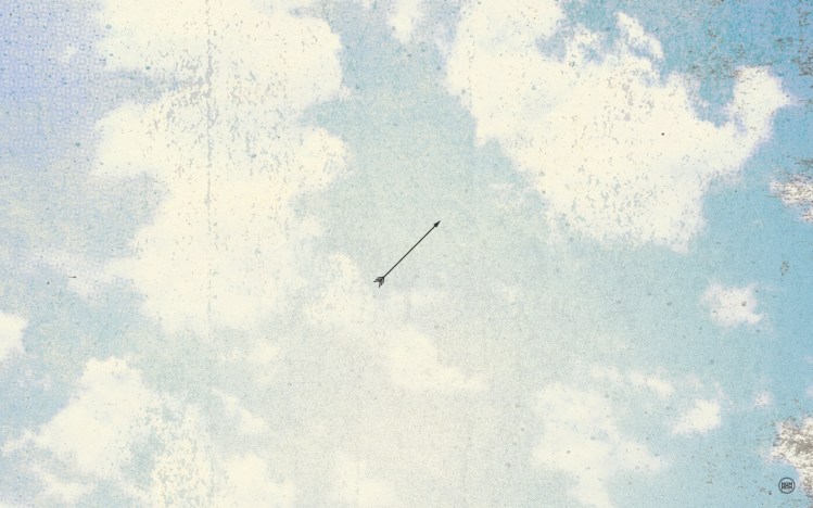
Flyin’ High In Da Sky Wallpaper

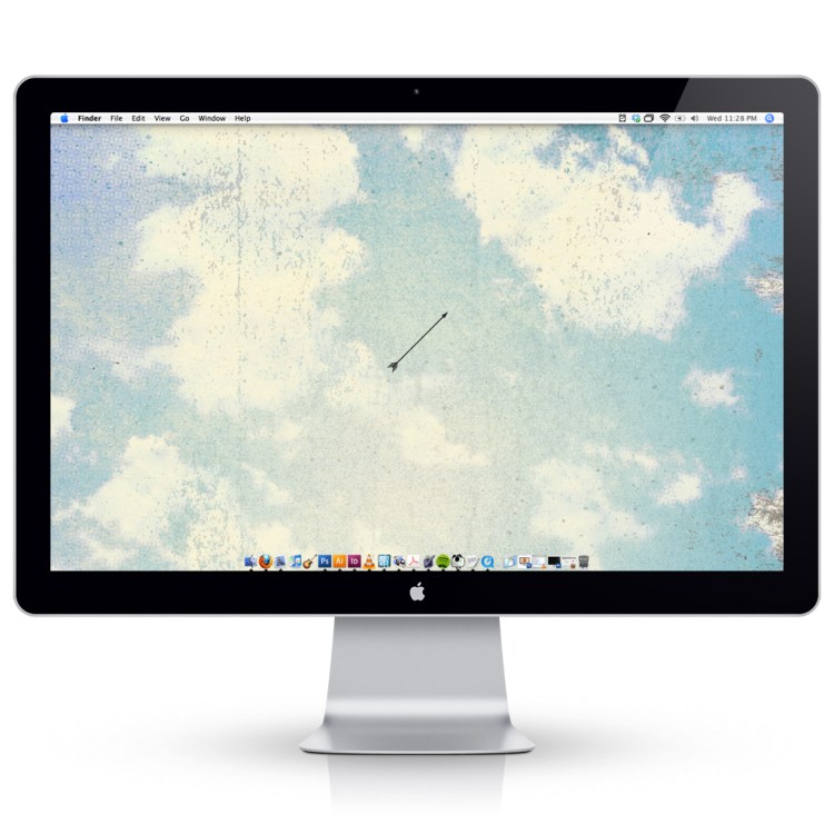
Holy cow, it’s been a while. I’ve been very busy with lots of work, day and night, and it was nice to be able to take a small (okay, not so small) break from updating this. But I wanted to throw a little something at you that you’ll hopefully enjoy and maybe get some use out of. In cleaning up my desktop and sorting some files I came across some old work that never got used for stuff, and wanted to mash some of it together to make something new. And with my newly cleaned desktop, I figured a wallpaper would be perfect. So give that a little click and do your saving from there.

(This could be you…)

Part Time Studios BBQ Themed T-Shirt Show

Doing group shows in general is always fun, let alone those with a theme set to them. Let alone when the theme is BBQ! And all of those things are happening together at Part Time Studios with this T-Shirt show opening on July 1st.

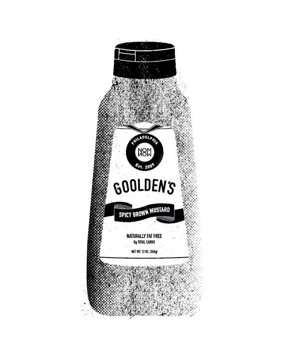
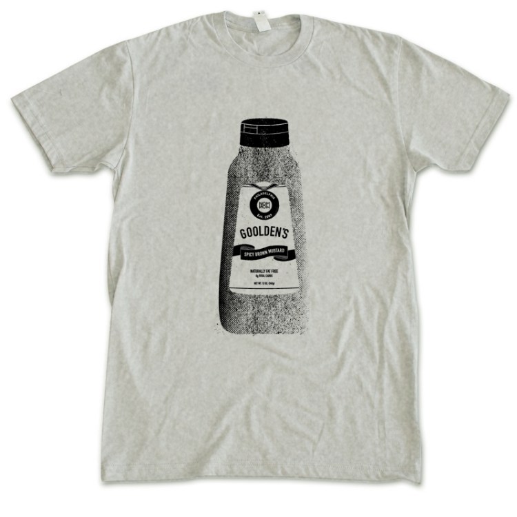
Gulden’s mustard is the best in the world (deal with it Grey Poupon), and although I certainly don’t limit my use of it to strictly barbecues, it’s absolutely a staple to any decent BBQ spread. I changed the spelling to match my own name, because artists can do whatever they want. Actually just because I love puns. Does that qualify as a pun? Who knows, I just did it.

These shirts are going to be a very limited run, so if you’re trying to walk around with mustard on your shirt in a non slob way, make sure you pick one up.

Nom Now Nautical Wallpaper

It’s been  a while since I made a wallpaper, and we do have a little thang goin’ on with AroundPhilly.com, so I decided it was time to make something crispy for yall. This was nautically inspired, and more so, made up of symbols I’d like to see on some “go to hell” pants.

The above is for your desktop, and the below would be some screens for your iPhone. Hope you enjoy!

Music Monday 5.16.11 U.S. Royalty

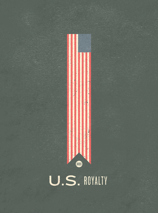
I discovered U.S. Royalty a few months ago and have been listening to them pretty steadily since. Their album Mirrors is a very impressive debut from these D.C. dudes, and I would certainly recommend checking it out. They also have served as the soundtrack to a few of the Gant Rugger seasonal look book videos, which are amazing in their own right. Check out the summer one here. Really great examples of how music and imagery can make a product exciting. You don’t know that you want the clothes as much as you want to be those people. I guess they are doing a perfect job at advertising in that sense. Anyway, I think U.S. Royalty was a perfect choice for the videos.

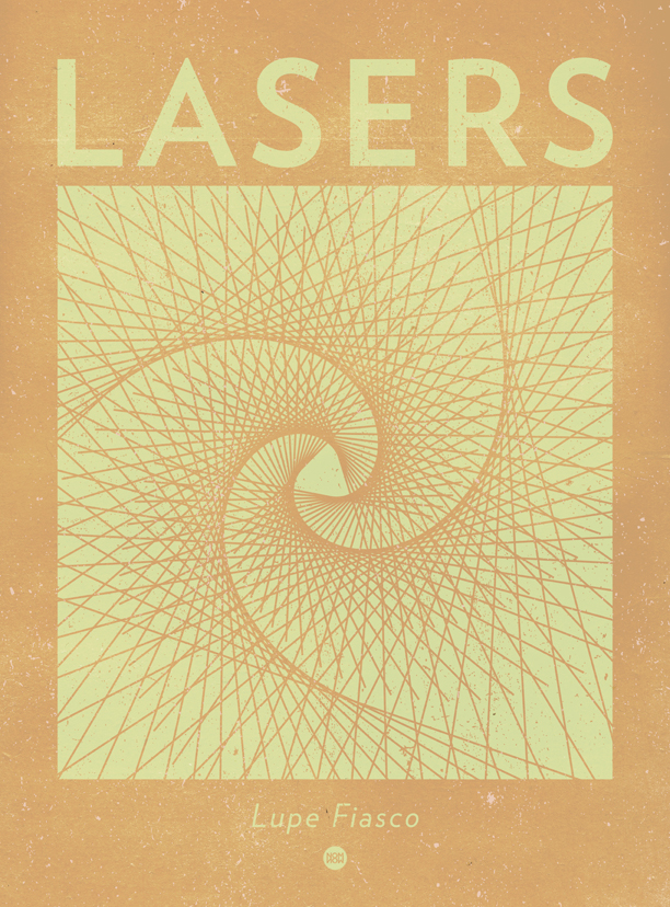
4.25.11 Lupe Fiasco

Sadly, two weeks ago my cousin’s boyfriend died from complications during a bone marrow transplant, after years of battling sickle cell anemia. Words really cannot describe the devastation this brings to everyone who knew either of them. Lateef, you will be missed and your spirit and essence will live on.
At his memorial, Emily told me that if I wanted to know and understand Lateef further, I should listen to Lupe Fiasco’s new album Lasers, which she described as just being “him.” Lupe was his favorite artist and he never got to hear the new album. I love so much that music has the ability to powerfully become a representation of a time or place, and in this case a person. I was excited and honored to be able to listen to Lasers for this very reason. In this sense, the album is remarkable and was absolutely insightful in understanding who Lateef was.
It’s hard to find the right things to say. Whether that be in trying show comfort, or trying to express your own pain, things can become too difficult to put into words. Music has the incredible ability to sometimes just do all of that for you. How amazing it is that this album be so closely knit to a person who should never be forgotten. Take a few minutes and listen to the albums closing track, Never Forget You.

Music Monday 4.18.11 Wye Oak

I finally got the chance to see Wye Oak this weekend when they played in Philly with my friends in Secret Mountains. They’ve been a band that’s been continuously growing on me, to the point now where I’m pretty obsessed. Jenn not only has an incredible voice, but also shreds on guitar. Seriously, they rocked and if you get the chance to see them, do it, one of the best shows I’ve seen in a while. They’re really putting a lot of two pieces to shame, not that they’re trying; everything seems extremely effortless.
Their new album Civilian is a an absolute must have for 2011. Possibly my favorite record of the year so far. So take that as you will.

The idea for this poster was entirely influenced by Kirby’s obsessions with finger spelling and sign language.

Music Monday 4.11.11 Sharon Van Etten

I got really into Sharon Van Etten this week. She’s got one of the prettiest voices going right now, and it was putting me in a bit of trance throughout the week. If you’ve never listened to her, please listen, she’s definitely one of those people who once you start listening you feel like you’ve been missing out all along. Like I said, just one of the most calming voices. Unique in her own way without being obnoxiously strange or anything. Just very good.

I did my best to make this poster look like how I feel she sounds. I hate both of her albums’ cover art, because I feel like aside from being dated (and not in a cool way) it so unrepresentative of how she sounds. That always bothers me.

Brick + Mortar Asbury Lanes Gig Poster

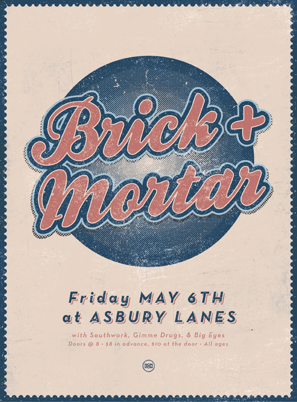
The guys from Brick + Mortar asked me to make a poster for their show next month at the always fun Asbury Lanes. For those of you who don’t know, B+M are a two piece band whose music can accurately be described as indescribable. One of the few bands who you can say don’t fit into a genre and not have that be a lame attempt to make a band sound more interesting than they really are. Brick + Mortar are in fact on of the most interesting and talented bands I’ve seen. And Asbury Lanes, of course, is an old bowling alley converted to do shows. The stage is actually right on top of the lanes. Definitely the coolest Asbury venue.

The start of baseball season and the vibe of the retro venue both played parts in the creation of this poster.

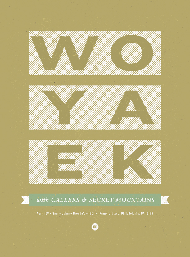
Wye Oak, Callers, Secret Mountains Gig Poster

Jeff asked me if would be interested in making a poster for their upcoming show in Philly with Wye Oak. And that answer will forever be yes. So here is the result of that. This is looking like it could be the show of the year thus far, so I’d really make an effort to be there if you can. This will be my first time seeing Wye Oak, for which I’m very excited and cmon, Secret Mountains are never a let down. See you there.

Music Monday 3.28.11 Danielson

In past week I’ve had a series of some very curious occurrences dealing with a band I’ve been trying to fully grasp for years now, Danielson. Ever since I’ve found out that Daniel is from the area I’m living, I’ve been hoping for Danielson to put on some sort of show in town. And this past Thursday, I nearly got the chance to see that.  It turns out that Kirby’s friend’s husband is in the band. Which is unbelievable. So anyway, I hear (at the last moment) that this show is happening, but by the time I get there, it’s looking like I just missed it. This is confirmed when I walk in and ask the person closest to the door I entered, who turns out to be Kirby’s friend!? Even more unbelievable. So I got to meet her and her husband Andy, and we talked for a little bit, and he filled me in on the latest and greatest of Danielson. Not the least of which being their new album Best Of Gloucester County. Which rules. It’s been 5 years since the last Danielson album and this all just seemed to come at a perfect time. I have been reminded why I love this band. Another perfectly strange but completely awesome album from the mind of Daniel Smith. They are playing at Johnny Brenda’s on April 17th if you’re interested, I’ll be there.

This poster gave me some trouble for a little bit. I spent a lot of time reworking a lot of things, but I’m glad it finally got resolved. Sometimes everything  just doesn’t come to you on the first shot. And being able to work around that is important. Plus, figuring out how something works is rewarding in the same way doing a puzzle is. Hope you dig, and check out the new album, for real.

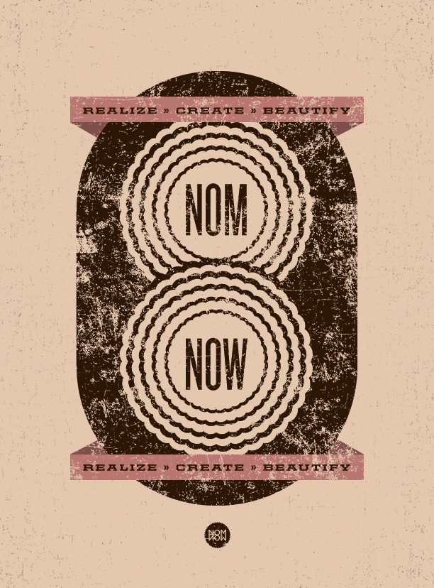
Nom Now Poster & Wallpaper

I hadn’t made something that was solely Nom Now focused for a little while. So I started working on this poster last week and finished it up last night. And because I love you all so much I made a wallpaper version as well. If you’re looking at this and thinking you’d like it in a size that I don’t have up here, let me know, a re-size is just a few clicks away. Enjoy!

Music Monday 3.21.11 Delicate Steve

Delicate Steve was the opening act for Akron/Family when I caught them at The Blockley in Philly a few weeks ago, and they totally impressed me. More often than not you’re sort of hoping the openers will just shuffle along quickly and quietly so you can see the band you came to see, but Delicate Steve wound up not being one of those bands at all.

I hate to admit, but the name was making me think they were a jam band or something, and that wasn’t really thrilling me, but it took not more than a minute to realize that was  incorrect, and even more so, they were one of the most unique and refreshing sounding bands I’d heard in a while, opener or not. After the show I immediately downloaded their full length Wondervisions, and I’d strongly suggest you do the same. I’ve been listening to this album pretty much non-stop all week, and I bet you’ll do the same.

The idea for this poster came from my favorite song on the album, Butterfly. The slide guitar on the song is so unbelievably good, that every time I listen to it, as soon as the song is over I just want to listen to it again. They have an amazing video for it, and it should be watched now.

I also found myself (like many of you, I’m sure) checking out the new album from The Strokes, Angles. I’ll be the first to admit I forgot The Strokes were a band, but there’s no doubt these guys are as cool as cool gets, and even though this album sounds different than some of their older stuff, it’s still good. However, the album art is pretty bad, which sucks because all of their other album covers have been great. This comes out tomorrow, so you have the rest of today to be a cool guy and get it a day early.

127 Hours Poster

I finally got to see 127 Hours this weekend, and after I did, I thought it would be good to make something in regards to it. Not that this movie poster was in need of a redesign, the one it had was actually really great, but I just wanted to make one in my own style.

If you haven’t seen this movie, make a point to catch it at some point, James Franco is great in it. The movie’s pretty difficult to watch at some parts, and the fact that this is based on a true story makes it even more so.

There’s a very distinct color scheme in the movie which I hope to have captured with this.

Music Monday 3.7.11 Nirvana

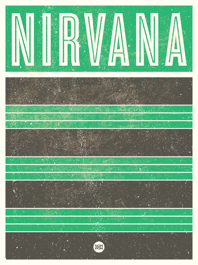
Still on a big Nirvana kick this week. I don’t know, the more I listen to them, the more I realize why such a big deal has been made over them for so long. It’s sort of hard to convey that though unless you actually just listen. This poster idea came from the shirt Kurt wore in the Smells Like Teen Spirit video. Shirt Cobain.

Had a chance to see Akron/Family and that was awesome despite a really trying crowd filled with some of the absolute oddest characters I’ve seen at one show. But nonetheless Akron/Family was still impressive.

Gave Destroyer’s new album a listen this week. It’s good but nothing beats Destroyer’s Rubies.

Music Monday 2.28.11 Nirvana

I shamefully admit that up until this week I never listened to Nirvana. I mean, I had heard them obviously, I think Smells Like Teen Spirit put them into a world of forever being known, but I never owned any albums and aside from a few singles, I wasn’t familiar with their discography at all. But after an amazing scene from Six Feet Under in which Nate is listening to All Apologies, which might be the best song ever, I wound up familiarizing myself with all their studio albums and loving it.

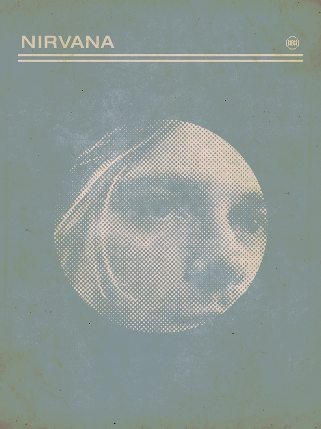
This poster is a turn style-wise from the ones I’ve been doing recently, but something didn’t seem right when I tried to brainstorm an iconic or fitting illustration to match the dourness of the band. What makes Nirvana Nirvana? All apologies (pun) to Dave Grohl and Krist Novoselic, but it’s Kurt Cobain. So what better way to represent this band then by using the face of the guy who represents an entire generation? If you’re in the same boat that I was, do yourself a favor and get familiar with this piece of music history. There. Was that cheesy enough for you?