Recently I’ve been wanting to create boundaries for my work. It’s sometimes fun to go nilly willy and try things that you’ve never done before, but I’d also like to get to a place where people can recognize that something is mine just because of the way it looks. So I’ve been following particular steps in how I take my photos, and what I do with them after wards, in hopes to create a uniformity within them.
I also read an article on the ISO50 blog talking about how he uses so few typefaces. This is also something I’m interested in doing. We all have our favorite go to fonts, and I am going to play on that.
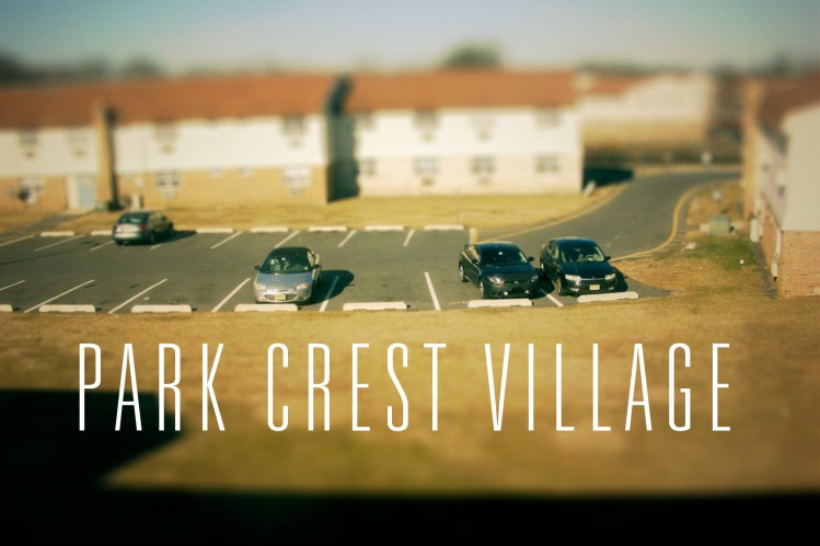
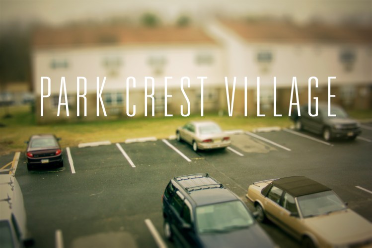
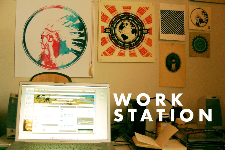
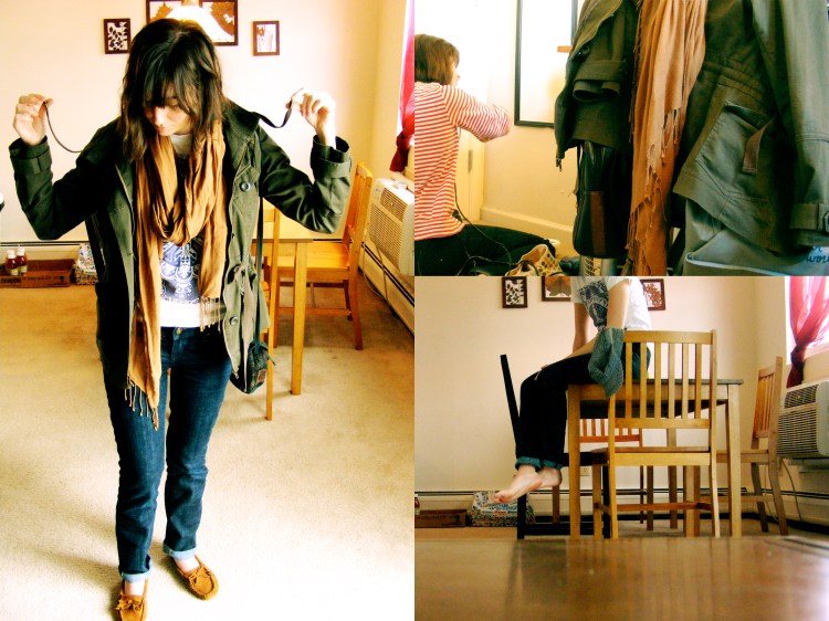
So anyway, today was a lazy day around the apartment, and I wanted to capture some of that. Anyone who’s been to Park Crest or in particular Kirby and Amy’s apartment knows what it’s like, and I hope this reflects it. Also, I always find it interesting to see the space that people do there work in. So I included a “work space” photo so you can see where my stuff usually goes down. Like I said, that kind of stuff is always intriguing so if you feel so inclined, I’d like to see where you do your best…and worst.
By the way all of these photos are large. So just click on them to see them full size.


The first two look like miniature models
Bingo!
Hey Matt, these look great! What’s the tall thin font? I’m building a new site and looking at different typefaces for inspiration. Love that one.
Thanks Alex.
It’s Univers 39 Thin Ultra Condensed.